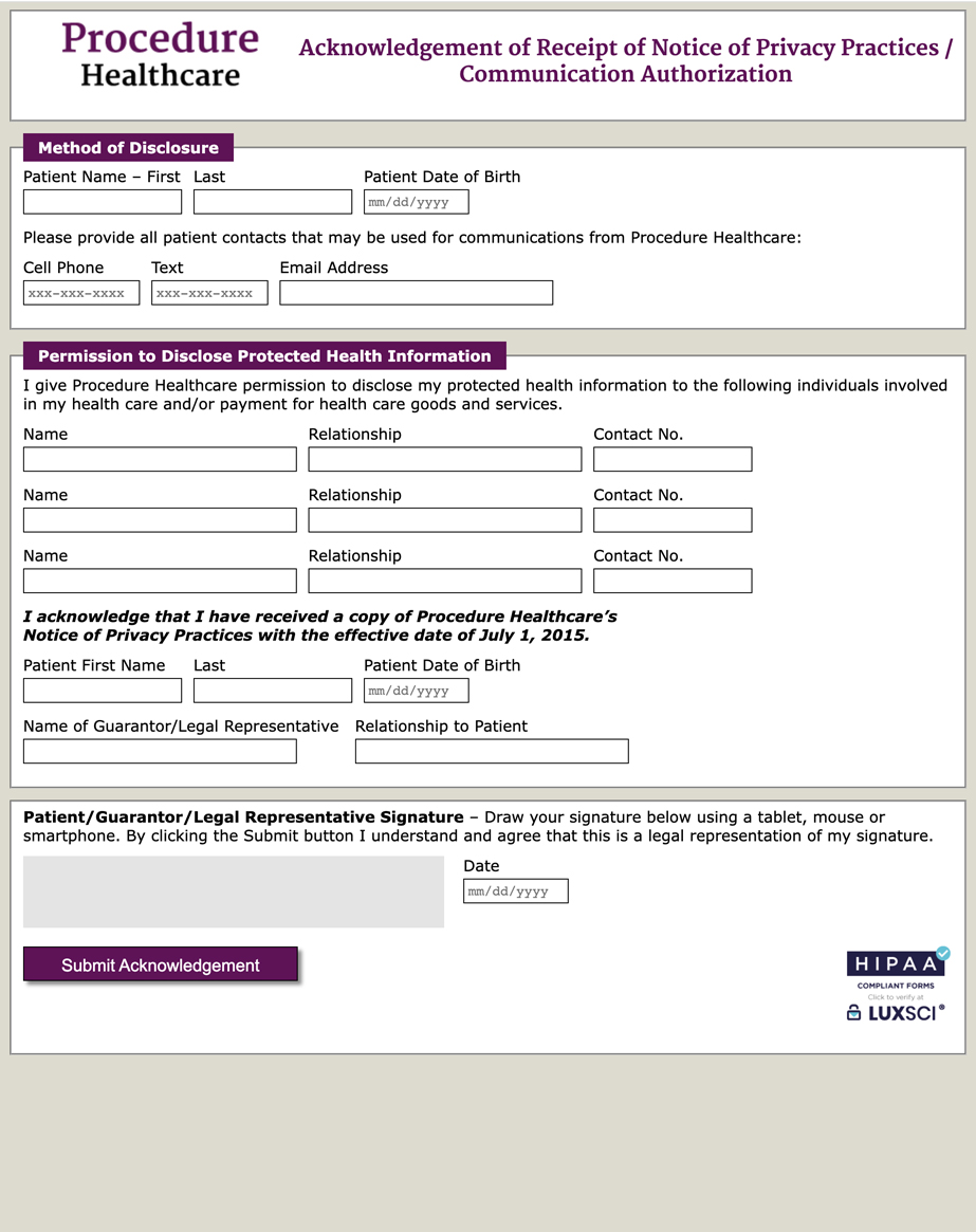
 After receiving your current form, as well as any changes you’d like to make, we’ll begin building the online form. This is a completely new document, in a user-friendly structure and format. You can see a full-size image of the actual form here.
We’ll work to optimize the functionality of the form on a field-by-field basis, occasionally changing the type of field used for a particular area. We’ll also rearrange the structure of a form to improve the flow where necessary.
The driving concept in this redesign is to improve the patient experience, because that’s what helps most to reduce the dreaded 'form abandonment' that occurs more than you’d expect. We’ll set up the form so that the same information is not requested more than once, and we can ensure that sections of your form that don’t apply to this user (based on answers to a previous question) won’t even show up.
We also endeavor to make sure that the form user understands what information is being requested, and what format it needs to be in. We’ll add 'placeholder text' that spells out the format of the desired answer (like MM/DD/YYYY) right in the field itself, and tool tips for more complex instructions.
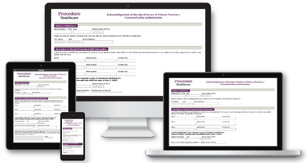
 The new online medical form will also be responsive, which means that it will appear perfectly readable no matter which device it’s viewed on. Instead of showing up vastly reduced in size, requiring the user to zoom into each area of the image and scroll in all directions to complete the form, the new form will rearrange itself to fit the viewport without reducing text or field sizes.


